Embed display modes
Inline, button or floating tab — which mode to pick when, and how it looks to the client.
When you embed booking on your own site, the first decision is how it should look. There are three modes plus a second setting for how the widget opens. This article describes exactly what each does, how it looks to the client on desktop and on a phone, and which type of site each suits.
All the settings live in one place: Setup → Public site → the “Embed” pill.
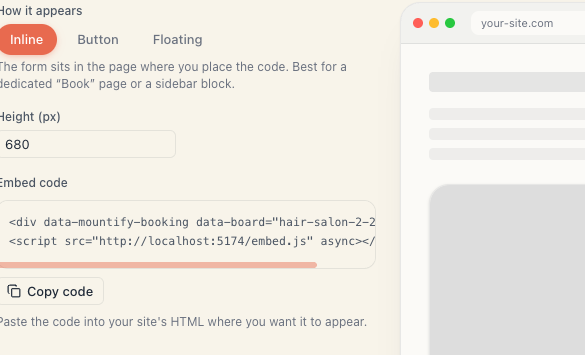
1. “How it appears” — the three modes
This is the first group of pills on the page, labelled How it appears.
| Mode | What the visitor sees | When it’s the right choice |
|---|---|---|
| Inline | The form sits in the page, where the code is | You have a dedicated “Book” page or a big empty block |
| Button | Just a button; booking pops up on click | You want a call to action in several places without taking up space |
| Floating | A permanent tab in the bottom corner of every page | You want booking within reach everywhere |
Under the picker a line of explanation appears and changes with your choice:
- Inline — “The form sits in the page where you place the code. Best for a dedicated ‘Book’ page or a sidebar block.”
- Button — “A button that opens booking in a popup (full-screen on mobile). Put the CTA in several places.”
- Floating — “A persistent floating button in the corner of every page — booking always within reach.”
2. Inline mode in detail
The form appears exactly where you put the code, as part of the page layout.
The setting that only appears here:
| Field | Values | Default |
|---|---|---|
| Height (px) | 360 – 1200, in steps of 20 | 680 |
The height is fixed. The form does not stretch by itself — if the content is taller than what you set, the frame gets its own scrollbar inside. That is normal, not a bug.
How to pick a height:
- 560–640 px — a narrow sidebar block.
- 680 px — the universal default. Works for most salons.
- 800–1000 px — if you have many services and want the whole list visible without scrolling inside.
Look at the preview on the right with your real services before you commit to a number. A salon with three services and one with twenty have very different needs.
3. Button mode in detail
Only a button appears on the page. On click, booking opens over the site.
The settings that appear in this mode:
| Field | What it does | Default |
|---|---|---|
| Button text | The label on the button | ”Book now” |
| Colour | The button’s background | Near-black navy (#111827) |
| How it opens | Popup or Side sheet | Popup |
The button always carries a calendar icon to the left of the text. Clear the text and only the icon remains — a compact round-cornered chip.
The button is a slightly rounded rectangle. There is no size or font setting — deliberately, so it looks consistent on any site.
4. Floating mode in detail
The tab sticks to the bottom-right corner of the window and stays there while the visitor reads and scrolls. It has the same settings as Button mode, but its shape is a fully rounded pill rather than a rectangle.
The only difference from Button mode is placement: the floating tab ignores where you put the code — it always anchors to the corner of the screen. That is why the floating snippet is best placed in a shared template (footer, header) that loads on every page.
If you already have something else in that corner — a chat widget, a cookie bar, a “back to top” arrow — check they don’t overlap. The script supports a
data-position="left"attribute that moves the tab to the left corner. It isn’t in the interface; you add it to the code by hand.
5. “How it opens” — the second choice
This second group of pills appears only in Button and Floating modes.
| Option | On desktop | On a phone |
|---|---|---|
| Popup | Pops up in the middle of the screen over a dimmed backdrop | Full-screen |
| Side sheet | Slides in from the right and fills the height | Full-screen |
Both give you:
- an × button in a thin bar at the top;
- close on the Esc key;
- close by clicking the dimmed backdrop.
On a phone the difference disappears — both are full-screen. So this choice only matters for desktop visitors.
Which to pick:
- Popup — more familiar, more neutral. A good default.
- Side sheet — feels more “app-like”; good for content-dense sites where you don’t want to cover everything.
6. Comparison at a glance
| Inline | Button | Floating | |
|---|---|---|---|
| Takes up space in the page | yes | no | no |
| Visible without scrolling | depends where it is | depends where it is | always |
| Can be in several places | yes | yes | pointless (only one) |
| Has a height setting | yes | no | no |
| Has text and colour settings | no | yes | yes |
| Can open as a side sheet | no | yes | yes |
7. Changing the mode later
The mode is not an account setting — it lives in the code itself. So:
- Go back to Setup → Public site → Embed.
- Pick the new mode and any extra fields.
- Press Copy code.
- Replace the old code on your site with the new one.
If you just paste the new snippet without removing the old one, you will have two widgets at once.
You can also combine: Inline on your “Book” page and Floating in the shared template. The script loads once and serves both.
8. What all three modes have in common
- They show the same booking flow — same services, same times, same prices.
- They carry the look from the booking-page editor, not your site’s styles.
- They render in an isolated frame (iframe) — safe, and no CSS conflicts with your site.
- They depend on the Online booking switch. If it’s off, none of the three shows anything.
What’s next
- Embed on your own site — the whole process and the code with examples.
- Add to WordPress — exactly where to paste the code.
- Troubleshoot the embed — when the widget doesn’t show up.
- Booking page overview — where the look is managed.