Create a banner
A promo card on the public page — a title, text, colour and a link to a service or code.
This walks the whole banner editor — six sections, field by field. The path is Setup → Banners, and the result is a promotional card on your public booking page.
For the page overview, banner order and visibility rules, see Promo banners on your page.
Banners need the Growth plan or higher. On Start the New banner button is locked.
1. Create the empty banner
- Open Setup → Banners.
- Press New banner at the top right.
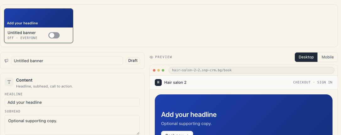
You get a Banner created confirmation. A new card appears in the strip named Untitled banner with the state OFF. The headline is still empty.
There is no template picker. A new banner always starts blank: a solid background, standard height, a button labelled Book now, audience Everyone (incl. guests), no schedule.
The editor below already shows the new banner, with the live preview on the right.
2. Give it an internal name
At the top of the editor there’s a row with a megaphone icon, a text field and a badge (Draft or Live).
That field is the banner’s internal name. Clients never see it — it exists so you can recognise the banner in the strip. Write something concrete: “March promo”, “BOGO manicure”, “New service — brows”.
It saves when you leave the field.
Everything in this editor saves automatically. There is no Save button. The indicator at the top right reads Editing… while you type, then Saving… and Saved.
3. The Content section
Subtitle: Headline, subhead, call to action.
| Field | Required | Advice |
|---|---|---|
| Headline | yes — without it the banner can’t go live | one short sentence; under 56 characters so it doesn’t wrap on a phone |
| Subhead | no | up to roughly 120 characters |
| Text colour | no | empty = the renderer picks based on the background (white over an image, ink over a light panel) |
| Panel colour (split) | no, split layout only | the background of the text half; empty = light |
The headline field carries the placeholder Add your headline. If a banner is blank, that’s what it says.
4. The Button section
Subtitle: Customise the CTA — label, action, colours, and icon.
First decide whether you want a button at all. The Show button switch is described as Off — the banner renders without a CTA pill. Useful for purely informational banners.
When it’s on:
| Field | What it does |
|---|---|
| Label | the button’s text, e.g. Book now |
| Action | what a tap does (see the table below) |
| Button colour | empty = white over images, ink over split |
| Button text colour | empty = matches the contrast of the button colour |
| Icon | a glyph to the right of the label; pick — for none |
The three actions
| Action | What it does for the client |
|---|---|
| Scroll to services | scrolls the page to the service list — the usual choice |
| Copy code | copies a promo code to the client’s clipboard |
| Open /me | opens the client’s own account (their bookings) |
Choosing Copy code reveals an extra field, Code to copy, hinted as 2–32 chars: letters, digits, dashes, underscores. Auto-uppercased.
The errors here are:
| Message | Cause |
|---|---|
| Code can’t be empty. | you picked the action but typed no code |
| Use 2–32 letters, digits, dashes, or underscores. | there’s a space or an unsupported character |
This field only copies text. It does not create a discount. The real discount is a loyalty rule — see Discount codes. If you type a code here that doesn’t exist as a rule, the client will copy it and checkout will reject it.
The eight icons are: none, arrow right, arrow up-right, chevron, sparkles, gift, heart and check.
5. The Background section
Subtitle: Image or solid. Overlay tunes legibility.
Pick a mode: Colour or Image.
Colour mode
There are ready-made gradient presets plus Custom background colour. The Reset button returns to the preset.
Image mode
- Upload a Background image — PNG, JPG, WebP up to 5 MB.
- Set the Focal point — click or drag on the image to choose what stays visible when the banner crops it. This matters: a banner is wide and short, so a portrait photo gets cut hard.
- Zoom — crop closer around the focal point. 100% = no zoom.
- Blur — softens the background so the headline pops. 0% = sharp.
- Image overlay — a dark layer over the photo. Without it, light text on a bright photo is unreadable.
The Replace image and Remove image buttons sit on the image itself.
The overlay rule: if your text is white and the photo has bright areas, raise the overlay until the preview reads cleanly. The readability check will warn you if you left it too low.
6. The Layout section
Subtitle: Pick variant and height.
Variant — two tiles:
| Variant | How it looks |
|---|---|
| Full-bleed | the image fills the whole banner, text sits over it |
| Split image | image on the left, text on the right in its own panel |
Height — Compact, Standard or Hero. This is the minimum height: the banner grows by itself if the content doesn’t fit.
7. The “Link a loyalty rule” section
Subtitle: Optional. Pulls personalised state (progress, countdown).
Pick a rule from the dropdown or leave — No rule linked —.
What linking adds:
- with a Buy N, get one rule — that client’s real progress (for example 7 / 10);
- with a Promo code rule — a code chip next to the button, labelled Use code.
When the rule is a Promo code type, a Promo code chip colours sub-section appears with Chip background and Chip text fields. Empty = your board’s accent colour.
Careful: if the linked rule is archived or expires, the whole banner disappears from the public page. That’s a safety net against advertising a code that no longer works.
8. The “Schedule & audience” section
Subtitle: When the banner shows, and to whom.
| Field | Meaning |
|---|---|
| Show from | the first day the banner is visible; empty = right away |
| Show until | the last day, inclusive; empty = forever |
| Audience | Everyone (incl. guests), Signed-in clients only or New customers (0 bookings) |
If the start date is after the end date, saving returns Invalid display window — the start date must be before the end date.
For time-boxed campaigns, see Seasonal campaigns.
9. The preview on the right
The Preview panel shows the banner as it will look. It has:
- a device toggle (desktop / mobile);
- a Preview as client switch — shows how it looks to a signed-in client with personal progress;
- the readability check underneath.
10. Publish the banner
- Go back up to the banner strip.
- Press the switch on the banner’s card.
- The badge in the editor flips from Draft to Live.
If the headline is empty you’ll get Add a title before publishing the banner.
Open the public page and check the result. If the banner isn’t there, walk the causes listed in Promo banners on your page.
11. A short worked example: a March promo
- New banner → name it March promo.
- Content → headline “−20% on all hair treatments”, subhead “Until 31 March”.
- Button → label “Book now”, action Scroll to services, arrow icon.
- Background → a photo of the salon, focal point on the station, overlay around 40%.
- Layout → Full-bleed, height Standard.
- Schedule → Show from 1 March, Show until 31 March, audience Everyone (incl. guests).
- Switch → Live.
If the discount should also be calculated automatically, create a separate loyalty rule with the same dates.
What’s next
- Promo banners on your page — management, order and visibility rules.
- Seasonal campaigns — a banner and a discount sharing one window.
- Discount codes — what makes a code real.
- Loyalty: reward rules — the rules a banner links to.