Mood & theme
Pick a 'mood' for your site, a light or dark theme, an accent colour and a font — with no developer.
Mountify does not hand you a blank page builder. Instead you pick a mood — a finished style with curated typography, shapes and atmosphere — and the whole page falls into place. On top of that you add a light or dark theme, your accent colour and, optionally, a font and a few structural details. It all lives in Setup → Public site, the Site settings tab, and every change saves the instant you click it.
Order matters. Mood first, then theme, then colour, then details. Start from the colour and you’ll end up changing it three times.
1. Pick a mood
The section is titled What’s the mood of your site? and hints: “Pick a mood — typography, shapes & atmosphere. Your colour and content stay yours.”
There are 23 moods, split into two groups.
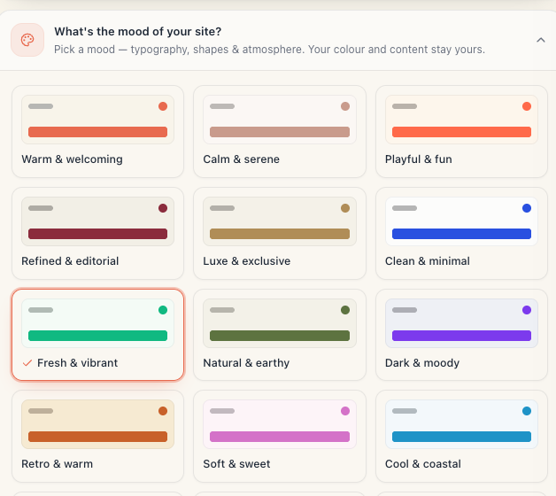
The «Light moods» group (19)
Each card is a tiny mock-up: a heading bar and an accent button over that mood’s own paper colour. The selected one carries a tick.
| Mood | Suits |
|---|---|
| Warm & welcoming | the default — a universal, friendly salon |
| Calm & serene | spa, massage, skincare |
| Playful & fun | kids’ studios, bright brands, nails |
| Refined & editorial | hair studios with a magazine look |
| Luxe & exclusive | premium services, gold accents |
| Clean & minimal | clinics, practices, “nothing extra” |
| Fresh & vibrant | fitness, wellness, green |
| Natural & earthy | eco skincare, organic brands |
| Retro & warm | barbershops, classic styling |
| Soft & sweet | nails, brows, pastel brands |
| Cool & coastal | pools, seaside venues |
| Bold & dramatic | a strong brand, red and black |
| Energetic & sporty | gyms, tennis, CrossFit |
| Chic & boutique | small boutique studios |
| Confident & corporate | clinics, dentists, offices |
| Cherry & charcoal | a deep red palette on light paper |
| Warm spice | warm, spiced tones |
| Navy & linen | restrained and classic |
| Crimson & cream | high contrast, memorable |
The «Dark moods» group (4)
Above them the page says: “These moods switch the whole site to a dark theme. You can switch back to light under ‘Theme’ below.”
| Mood | Suits |
|---|---|
| Dark & moody | evening studios, tattoo, bars |
| Dark forest | nature and wood on a dark ground |
| Dark & crafted | barbershops, craft brands |
| Neon & cyber | late-night venues, bright neon |
Picking any of these four turns the site dark automatically. If you want the dark typography but a light background, pick the mood and then set Theme → Light.
2. «Theme» — light or dark
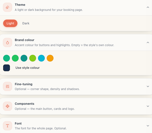
The Theme section, hint “A light or dark background for your booking page.” Two pills:
- Light
- Dark
The theme is independent of the mood. All 23 moods work in both modes — the mood cards and the live preview repaint immediately to match the theme you chose.
How the active mode is decided: if you have touched this toggle, your choice wins. If you haven’t, the four dark moods start dark and the other 19 start light.
3. «Brand colour» — the accent
The Brand colour section, hint “Accent colour for buttons and highlights. Empty = the style’s own colour.”
- At the top sit six swatches — suggestions curated for the mood you picked. The first one is the mood’s own colour. One click selects.
- Below them is the free picker — click it and enter any colour you like.
- Once a colour is set, a Use style colour button appears; it clears yours and returns the mood’s colour.
What the accent tints: primary buttons, active states, the stars on reviews, the promo-code chip on banners.
Contrast tip: on a dark theme a dark accent makes buttons melt into the background. The six suggested swatches are already checked against the current theme — start from those.
4. «Fine-tuning» — optional
The section is collapsed by default; click the heading to open it. The hint is “Optional — corner shape, density and shadows.”
| Field | Options | Default |
|---|---|---|
| Corners | Sharp · Soft · Round | Soft |
| Density | Compact · Balanced · Spacious | Balanced |
| Shadows | None · Subtle · Lifted | Subtle |
- Corners changes the radius of every card and button. Round gives a pill; Sharp gives a rectangle.
- Density changes spacing. Compact fits more services on screen — good for a long menu; Spacious breathes more.
- Shadows decides whether cards hover above the paper.
5. «Components» — optional
Also collapsed. The hint is “Optional — the main button, cards and logo.”
| Field | Options | Default |
|---|---|---|
| Primary button | Solid · Outlined · Ghost · Underlined | Solid |
| Cards | Bordered · Flat · Elevated · Pill | Bordered |
| Logo shape | Circle · Rounded · Square | Rounded |
Careful: Ghost and Underlined make the primary button far less noticeable. On a booking page the primary button is the only thing that earns money — don’t hide it unless you’re sure.
6. «Font» — optional
A collapsed section, hint “The font for the whole page. Optional.” Five chips, each rendered in its own family:
- Style default — the font of the mood you picked (the default choice).
- Fraunces — serif, warm, characterful.
- Playfair — serif, elegant, premium.
- Bricolage — sans with personality.
- Inter Tight — sans, tight, neutral.
The choice applies to headings across the whole page.
7. Check both screens
- In the Live preview panel switch to Mobile — that is what most people see.
- Switch to Desktop and check the same thing on a big screen.
- Press Open page and look at the real page.
- Open it on your own phone too, in daylight. A dark theme outdoors in the sun is a different experience from a dark theme on a monitor.
How to choose if you can’t decide
- Pick the mood that best matches the feeling of your salon. Ignore colour for now.
- If your place is bright and welcoming, leave Theme → Light. If it’s an evening, atmospheric venue, take a dark mood.
- Pick an accent from the six suggestions.
- Stop. Don’t touch Fine-tuning, Components or Font on day one.
Troubleshooting
| Symptom | Cause | What to do |
|---|---|---|
| I picked a mood and the site went dark | The mood is in the Dark moods group | Set Theme → Light if you want a light ground |
| The buttons are barely visible | The accent is too close to the background, or Primary button is Ghost | Pick an accent from the six suggestions; go back to Solid |
| My colour isn’t applied | You never left the picker, or the request failed | Check the pill in the top right reads Saved |
| I want the mood’s colour back | A manual colour always wins | Press Use style colour |
| I can’t find Font | The section is collapsed | Click its heading to open it |
| The change isn’t live yet | The public page’s short cache | Wait half a minute and hard-reload with Ctrl+F5 |
| My logo is round and I want a square | Shape is a separate setting | Components → Logo shape |
What’s next
- Brand your page: logo, name, photos — the content the style dresses.
- Page photos & gallery — how photos work with the mood you chose.
- The booking-page editor — every section and the live preview.
- Promo banners on your page — banners carry their own colours, independent of the mood.